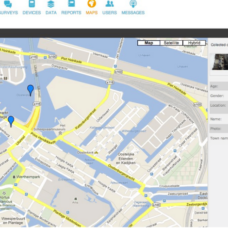
In 2006, two water aid professionals used GPS devices to plot wells and other water points on a map of a district in Malawi. According to the numbers on a spreadsheet, there was plenty of water access per person. But the map told another story. Water points were clustered in some areas and spread thin in others, so that some people had to travel for miles to fetch water.
The problem was hidden until visualizing the data revealed it. Ned Breslin, who now heads Water for People, recalls that experience as the conception of FLOW (Field Level Operations Watch), the Android device and Web browser application. With FLOW, roving water aid workers update a database in the cloud using an app installed on their phones. The water points pop up on an online map, updated in real time. If a well is contaminated or a pump is broken, that information is visible.
[See our coverage: How FLOW can change development work]
Announcing Akvo FLOW 1.5
Now the software has undergone an important update. The transformation began in 2012 with the addition of “Akvo” to its title, when FLOW changed hands from Water for People to Akvo, a non-profit, open-source software builder that supports aid and development work.
Then, throughout January, Akvo rolled out an overhaul and announced Akvo FLOW 1.5.
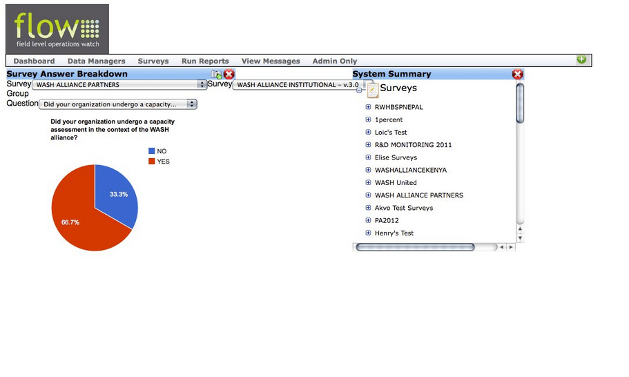
The changes The most striking changes are cosmetic. But as a data visualizer, Akvo FLOW has shown that looks matter. And, of course, there are also back-end updates that are not visible on first glance.
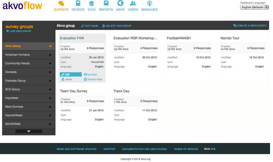
The update is most obvious on the dashboard. The menu is now organized into tabs, with each option demarcated by sky-blue icons.
“The user interface is one of the most important things that you can do well. We really went back to the drawing board on that,” Caetie Ofiesh, the product manager for Akvo FLOW in Washington, DC, told E4C.
Akvo is aiming for a more intuitive interface. Web users (and those of us who can still remember using a filing cabinet) are used to clicking on tabs. So, Akvo FLOW’s interface is new, but familiar, and the look is clean.
It is now easier to see which devices are connected to the Dashboard, and it is easier to assign levels of permissions to people within your organization. And if any of that is confusing to newcomers, help tips are strewn throughout.
The update also simplified the home screen of the field surveys. And on the back end, it upgraded the datastore and software deployment.
“This release has been about scale, making FLOW a tool that is appropriate for a larger number of users. And also about broadening what the tool does for people in the water sector and outside of it,” Ofiesh says. She gives a thorough overview of the updates on Akvo’s blog.
A generic tool
Akvo FLOW was conceived among water experts, but its name and its origins notwithstanding, the software is not restricted to water organizations. It is, at its heart, an elegant system for mapping data. Data of many kinds. It has already been used in other fields, including managing medical supplies at clinics, studying the quality of healthcare services, monitoring food security and tracking illegal fishing expeditions, among others.
“I always say that FLOW is incredibly generic. But I mean that in a good way. It’s a GPS point, it’s data collected using a custom survey, and a photo or a video, all bundled together and transmitted and analyzed and then displayed and visualized together. So the basic premise behind it is extremely simple and there’s no reason why it couldn’t be used for a wide ranging set of things,” Ofiesh says.
Training
The update improved the training materials available for the software, and Akvo will hold training sessions throughout the year. Details are available at help.akvo.org.


